Text-resize is not the same as zoom
First posted on April 6, 2026 — last updated on April 7, 2026
Text-resizing and page zoom are often treated as interchangeable, but they are fundamentally different mechanisms. While zoom is enough to meet accessibility requirements, text-resizing is what truly respects user preferences.
The differences
- Zoom scales the entire page: layout, images, and text. Which is not always what’s desired. Text-resizing, on the other hand, affects only (you guessed it) text, greatly improving readability while keeping whitespace at bayFootnote 1.
- Zoom is applied at the page level, while text-resizing depends on user-defined settings such as the browser’s default font-size. This means that users rightfully expect these preferences to work consistently across all websites, and if they don’t, it’s your site that feels “broken”.
- Zoom functionality is provided by the browser, you just have to keep your website responsiveFootnote 2. Text-resizing would be too, if only developers wouldn’t inadvertently brake it using fixed units (such as
px) for text-related properties.
What WCAG actually requires
The SC 1.4.4 Resize Text (opens in a new window) does not mandate a specific technique for scaling text, as it states:
Content satisfies the success criterion if it can be scaled up to 200% using at least one text scaling mechanism supported by user agents.
Zoom is therefore a perfectly valid way to satisfy this requirement.
Why go beyond zoom
If zoom already ensures compliance, why care about text-resizing as well?
Because meeting the standard is not the same as serving users well. It’s just a starting point.
Text-resizing respects user preferences at their source. It allows users to define how they read content across the web, rather than forcing them to adjust each page individually via zoom.
Plus, the difference is wildly evident when you compare the two side-by-side. Just take a look:
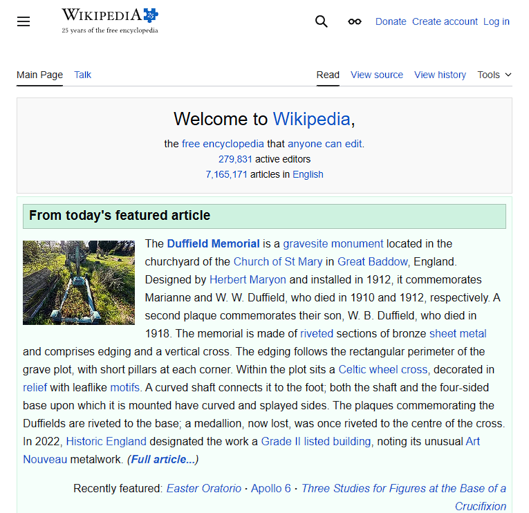


Comparison of the Wikipedia homepage in three states: default, text resized to 150%, and zoomed to 150%. Text-resizing increases font-size while preserving layout and spacing, whereas zoom scales all elements (including images and whitespace) and it’s shown to trigger the mobile layout.
What you should do
Forget using px for text-related properties, instead use:
remoremforfont-sizeFootnote 3;- relative or unitless values for
line-height; - relative units for
letter-spacing.
Also, be careful to avoid fixed-height containers for textual content, especially when using overflow: hidden, as it can cause text to be cut off when resized. Prefer min-height whenever possible, or at least ensure the containers are scrollable.
With this in place, you’re not just compliant, you’re actually supporting your users.
Until next time, be (and code) well!